
Worldwide imagery services are great. They’re great additions to the navigation apps on your phone, they’re useful reference maps for displaying data, and you can even lose countless hours scrolling around the Earth looking at weird things. But what they’re not good for is mapping things. And by mapping things, I mean you see a feature that you need mapped, and you click on it to get its coordinates. At best, this can be a bit sloppy, but at worst you can be off by a long way. Here we give an example of a situation where the imagery was very wrong.
Mapping from the imagery basemap
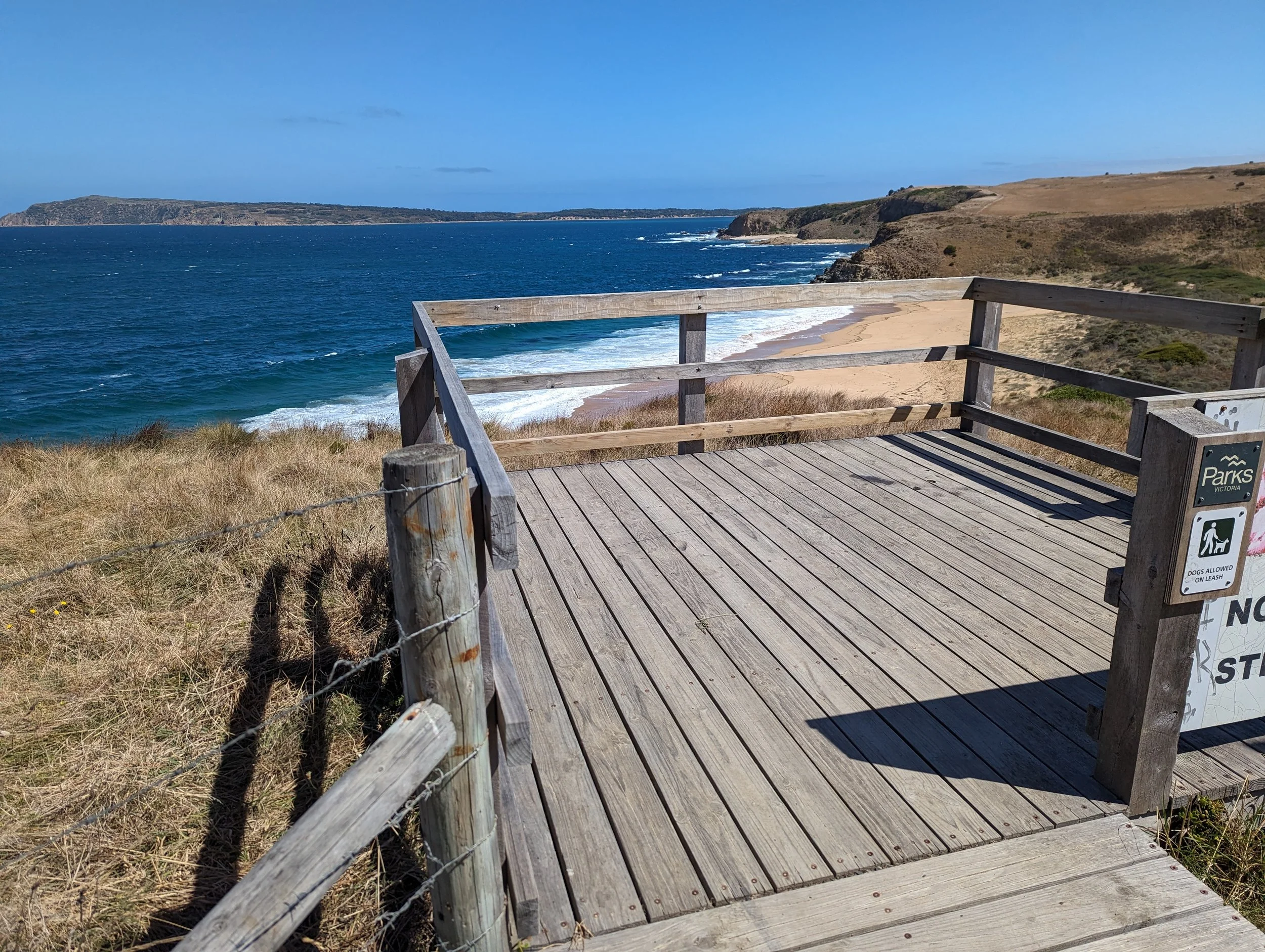
Here we have a lookout on a cliff as shown by a worldwide imagery service.

Our case study location. A lookout on top of a cliff.
We mapped the corners of the lookout based on the imagery basemap, using GIS.

The lookout after being mapped from a worldwide imagery service.
All is looking right. We could probably estimate the dimensions of this lookout, and if we plotted the centre point, we could refer to it as its location.
Mapping with high-accuracy
Next we went to the lookout.
And mapped it’s corners using a high-accuracy GPS. For the gear heads, we were using an Emlid RX Network RTK rover receiving corrections from the AUSCORS NTRIP broadcaster. While mapping we averaged between 1 cm to 3 cm horizontal accuracy.
The comparison
We overlaid our field data with the points mapped from the imagery basemap and found that they were over 8 m different. When talking about the location of assets or trees, or transport infrastructure, etc. being incorrect by 8 m would be horribly incorrect.
That doesn’t mean that all imagery is not useful. Some imagery sources are accurate. These are generally more limited in their extent (i.e. don’t have worldwide coverage) and often you have to pay for them. Here is an example of our data above, with a higher-accuracy image service laid underneath. This imagery service claims to have +/- 10 cm horizontal accuracy.

Our data displayed over higher accuracy imagery. Blue dots are those mapped from GIS using the worldwide imagery service. The green dots are those mapped with RTK. Note the consistency between the higher accuracy imagery and the RTK data.
The take away is, don’t map from imagery basemaps if you’re not familiar with their horizontal accuracy. Don’t try and use your phone’s GPS to validate the basemap, as it too could be incorrect and give the false impression that things are accurate.
Use worldwide imagery services for what they’re good for. A general guide to where things are and a useful basemap for adding context to data. Not for accurately mapping the world around you. You could make a huge mistake!
If you have any questions about your imagery, or need help understanding the different imagery services available, reach out for a discussion!