
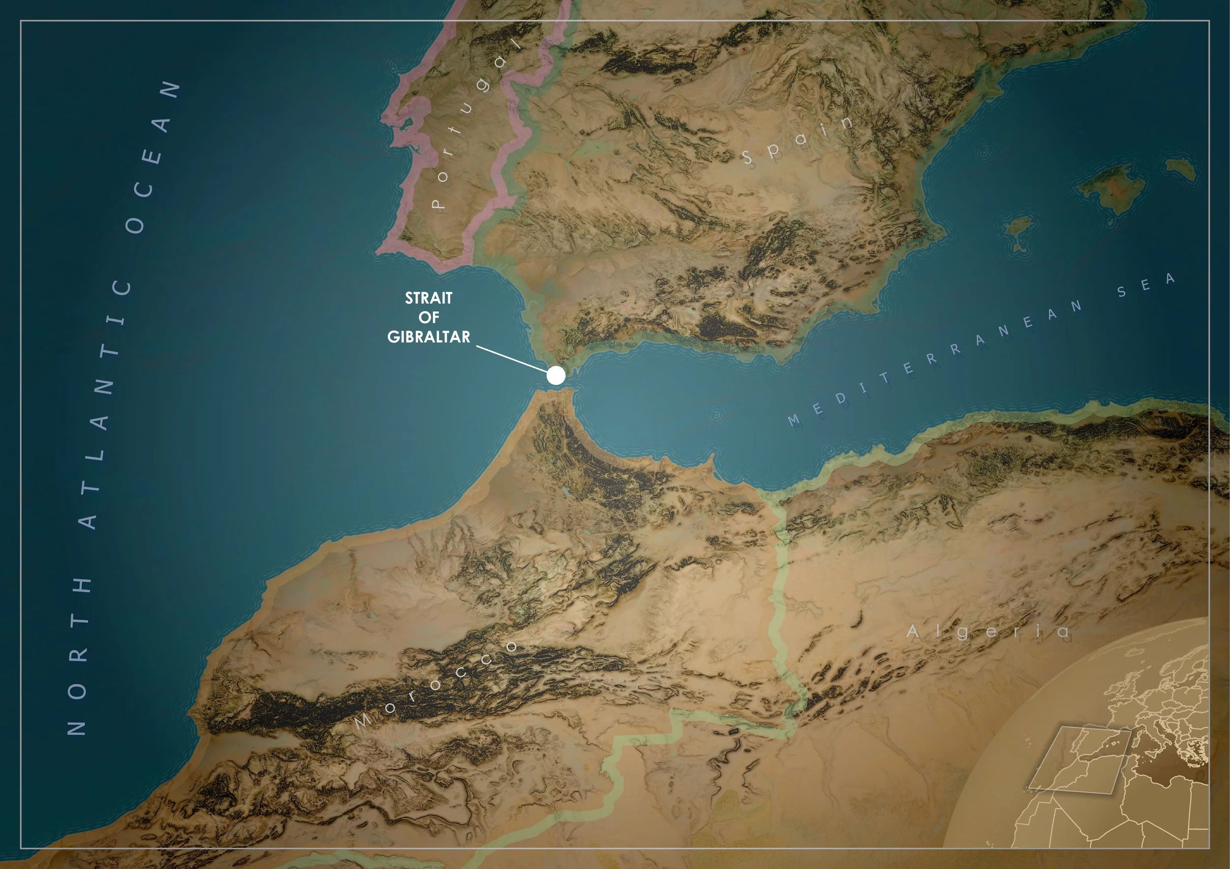
There’s something compelling about the Strait of Gibraltar as a mapping subject. It’s narrow, dramatic, and packed with visual contrast. Europe and Africa almost touch, the Atlantic spills into the Mediterranean, and the terrain shifts quickly from coastal plains to rugged mountains. It’s the kind of place where a good map can do more than show location. It can tell a story about landscape and connection.
This map wasn’t built with anything particularly exotic. It’s a combination of standard ArcGIS Pro tools, a few well-known terrain techniques, and a fair bit of visual tuning. What matters is how those pieces are brought together.
Setting the scene
The process starts simply. A new project, a new map, and a deliberate choice of projection. For this part of the world, Europe Lambert Conformal Conic is a solid option. It handles mid-latitude regions well and keeps the shape of Spain, North Africa, and the Mediterranean looking natural without noticeable distortion.
From there, the focus shifts to defining the working extent. Rather than relying on a default map view, a polygon map note is added and used to draw a clean rectangle around the area of interest. This step might seem minor, but it becomes the backbone of the whole workflow. That polygon is used repeatedly for clipping, masking, and framing, so getting the composition right early makes everything easier later on.
With the extent locked in, elevation data comes next. A DEM from the Living Atlas provides the foundation for the terrain. It’s brought into the map and immediately exported to a local raster at the highest available resolution. That export step is important. It removes reliance on the service and allows raster functions to run more smoothly and consistently.
Building the terrain
The terrain is where most of the visual character comes from, and this is heavily inspired by techniques popularised by John Nelson. The idea is not to rely on a single hillshade, but to layer multiple representations of the surface to create something richer and more nuanced.
The first step is to generate a couple of smoothed versions of the DEM using the Statistics raster function. A 10 by 10 mean filter produces a lightly blurred surface, while a 20 by 20 filter pushes that smoothing further. These become “Blur 10” and “Blur 20”. They strip out fine detail and leave behind broader landform shapes.
Hillshades are then created from all three surfaces. The original DEM, Blur 10, and Blur 20. Each hillshade is set to a soft light blend mode, which allows them to interact with each other without overpowering the map. The original DEM contributes the fine detail, while the blurred versions add broader tonal variation. Together, they create a more natural sense of depth.
Slope rasters are generated from the same three surfaces. Instead of using the default symbology, the colour ramps are inverted so that darker tones represent steeper areas in a way that complements the hillshade. These slope layers are then set to multiply blend mode, which deepens contrast and subtly enhances terrain structure.
A final touch comes from creating a hillshade of the slope raster itself. This acts like a soft edge detection layer, helping to pick out ridgelines and breaks in the terrain that might otherwise be lost.
All of these terrain layers are grouped together and the group is set to soft light. From there, it becomes a process of refinement. Some layers are turned off, others are made partially transparent, and a few might not contribute much at all depending on the resolution. This is where the map starts to feel less like a stack of rasters and more like a cohesive surface.
Shaping the land and sea
With the terrain in place, the next step is to build the geographic context around it. World Countries and the Global Background layers are added from the Living Atlas and then exported locally, just like the DEM. Keeping everything local helps avoid performance hiccups and gives full control over processing.
Using the area of interest polygon, both layers are clipped to the working extent. This immediately tightens the composition and removes unnecessary clutter. From there, a couple of erase operations do most of the heavy lifting.
By subtracting the area of interest from the global background, a mask is created that sits over everything outside the map frame. Symbolised in white, it effectively hides the rest of the world and keeps attention focused where it should be. A second erase operation subtracts the country polygons from the area of interest to create a dedicated ocean layer.
The ocean is styled with a solid fill and a coastal rake effect, which adds a sense of movement and texture along the shoreline. The land is given a pale yellow tone, leaning into that dry, Mediterranean and North African palette. Applying a soft light blend mode to the land layer helps it integrate with the terrain shading beneath, rather than sitting flat on top of it.
At this stage, the map has a strong physical presence. The terrain reads clearly, the land and sea are distinct, and the overall tone is set.
Layout, typography, and finishing touches
Moving into the layout is where everything gets pulled together. An A4 landscape layout provides a clean canvas, and the map frame is positioned to make the most of the Strait itself.
To subtly guide the viewer’s eye, a vignette is added by drawing a polygon over the entire layout and applying a circular gradient fill. Darker edges fade toward a lighter centre, creating a gentle spotlight effect without being obvious. A neatline is then added by adjusting the border properties, giving the map a crisp white frame that sits just inside the edge.
Country boundaries are enhanced by duplicating the countries layer and applying a donut-style symbology to create outlines. Using bevel and accurate settings softens the edges slightly, and reducing the opacity keeps the effect understated.
Typography plays a big role in the final look. Country labels are set in Century Gothic, coloured white, and spaced out significantly with increased letter spacing. The placement is set to curved in polygon so the labels follow the shape of each country. To lift them off the background, a second text layer is added within the label symbol, coloured a soft grey and offset slightly using a move effect. This creates a subtle shadow that gives the impression the labels are hovering above the terrain.
Ocean labels follow the same idea but are larger, with slight colour variation to differentiate them from the land. These are placed manually to get the composition just right. The Strait itself is marked with a simple white point and label, acting as the focal anchor of the map.
Adding context with an inset
The final element is a small inset globe that provides geographic context. This is built in a separate map using the World From Space projection. By adjusting the centre point of the projection, the area of interest is positioned in the top left of the globe, which creates a more dynamic composition than a centred view.
The styling mirrors the main map. Countries are filled with a similar tone, borders are light, and the global background is included. A circular gradient stroke is applied around the globe to give it a soft edge, fading toward the centre. The area of interest polygon is added on top and symbolised with a gradient stroke that gives it a slight shadowed highlight.
Once added back into the main layout as a map frame, the inset is positioned in the corner and scaled until it feels balanced with the rest of the design.
Bringing it all together
The final export is a straightforward high-resolution JPG, but by this point the heavy lifting is done. What started as a basic map has been built up through layers of terrain processing, careful masking, and thoughtful styling.
What makes this workflow effective is not any single step, but the way each piece contributes to the whole. The terrain techniques add depth, the masking keeps the composition tight, and the typography ties everything together. It’s a process that can be adapted to almost any landscape, but it works particularly well in places like the Strait of Gibraltar, where geography does most of the storytelling for you.
